JELL-O Experience
Problem
JELL-O's brand managers asked us to conceptualize how much of JELL-O.com's content and digital assets could surface under their Facebook brand page. A moderate budget and existing platform conventions placed boundaries on our strategy early on.
- Company:
Kraft | JELL-O
- Agency:
Crispin Porter & Bogusky
- Format:
Facebook Canvas Application
- Role:
Experience Designer - Team of 2
- Involvement:
Concept Ideation, UIE, IXD
- Tools:
Adobe InDesign, Illustrator, Fireworks
Solution
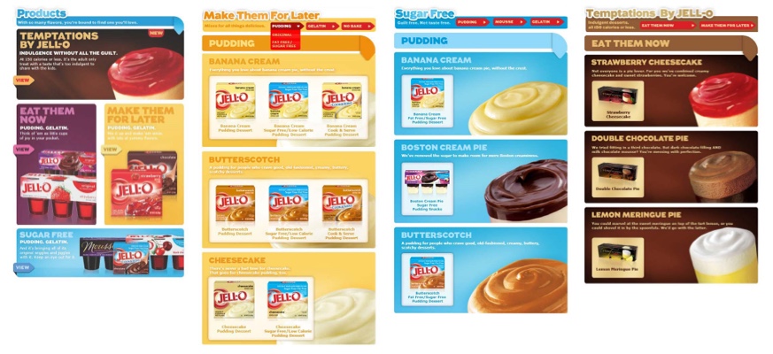
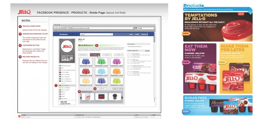
JELL-O's Facebook product listing
The solution included a Facebook Canvas web application that surfaced the majority of JELL-O's edible products and gelatin molds bringing the social experience close to parity with the JELL-O.com site. This feature was added as a new tab, paired down from our full designs, in the existing branding page navigation hierarchy. While we did not secure funding to integrate all of our designed features, the explorations were useful, and the project was a success. All told, the results were well received, and the brand enjoyed getting closer to the hundreds of millions of users that Facebook enabled them to reach.
Process
Context and framework research
Content Inventory and Information Architecture
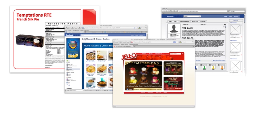
The client provided extracts of their product listings for our use. We completed a high-level review of the content architecture and came up with the content inventory shown on the left.
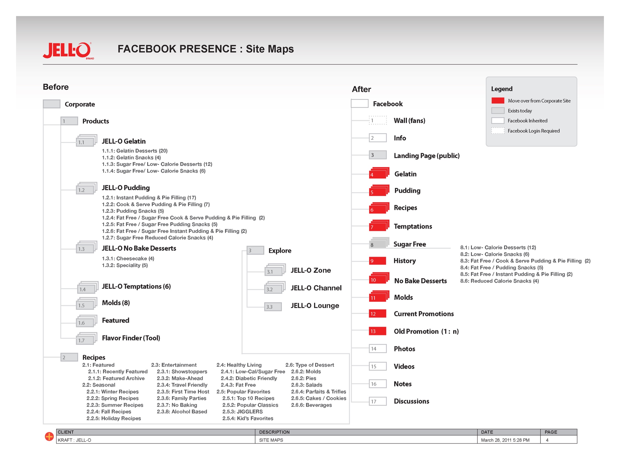
Site map
Facebook User Flows
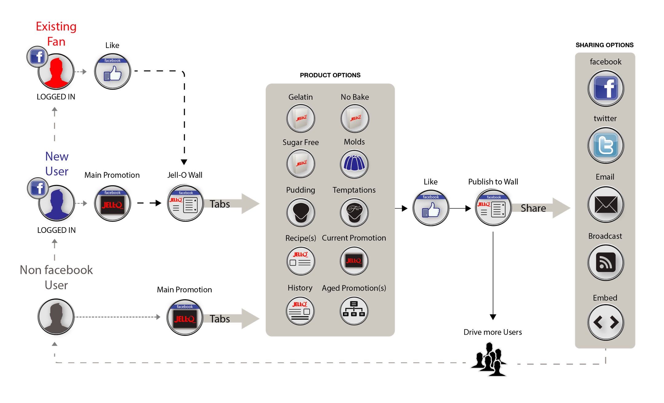
User Flows
User Interface Engineering
We designed the primary user interface layout, structures, and interactions that adhered to the given FB framework constraints—mainly screen real estate and navigation—and also the UI opportunities that a large social media platform affords. We created a system traversal strategy that facilitated primary and micro-interactions in support of all essential use cases.
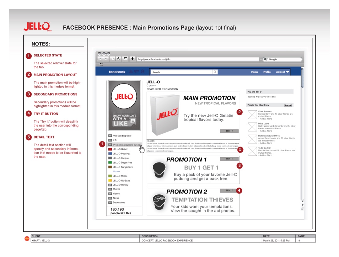
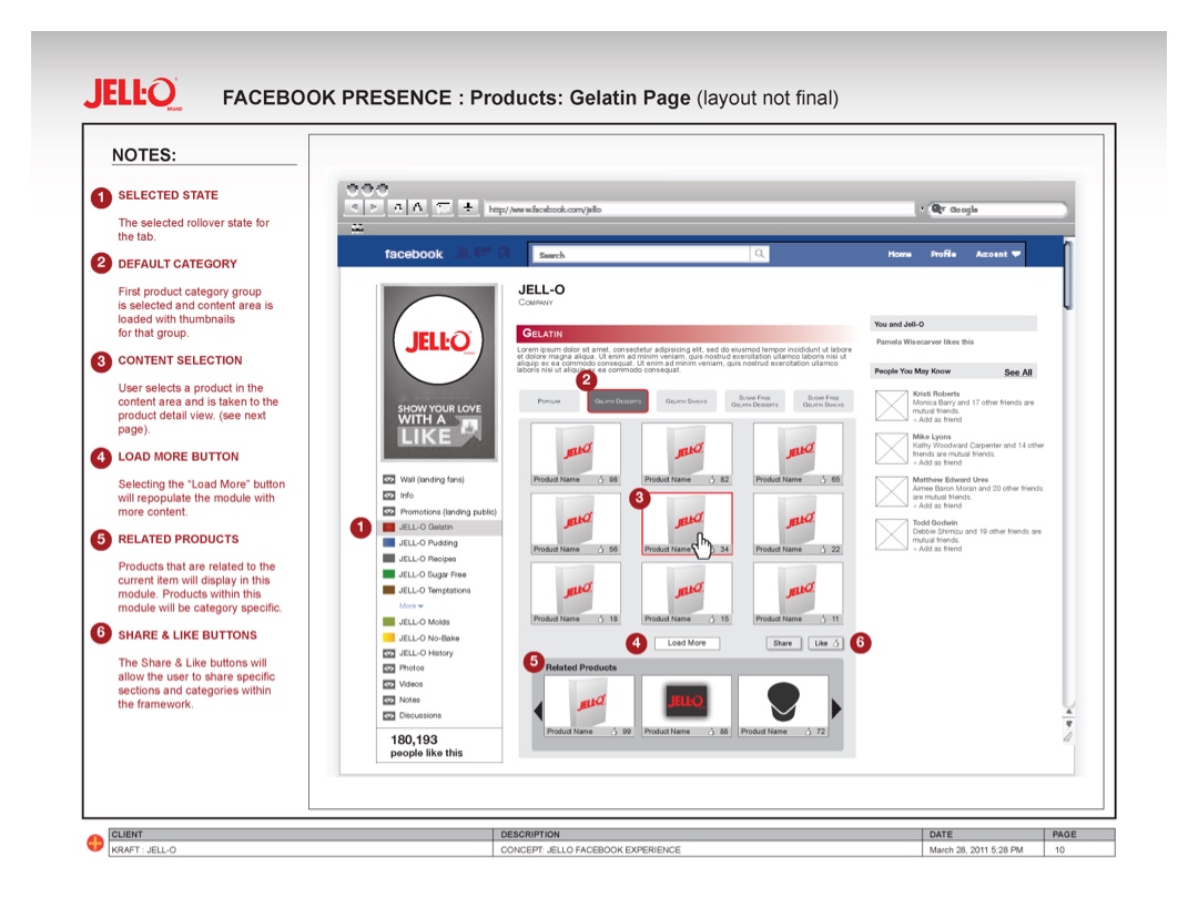
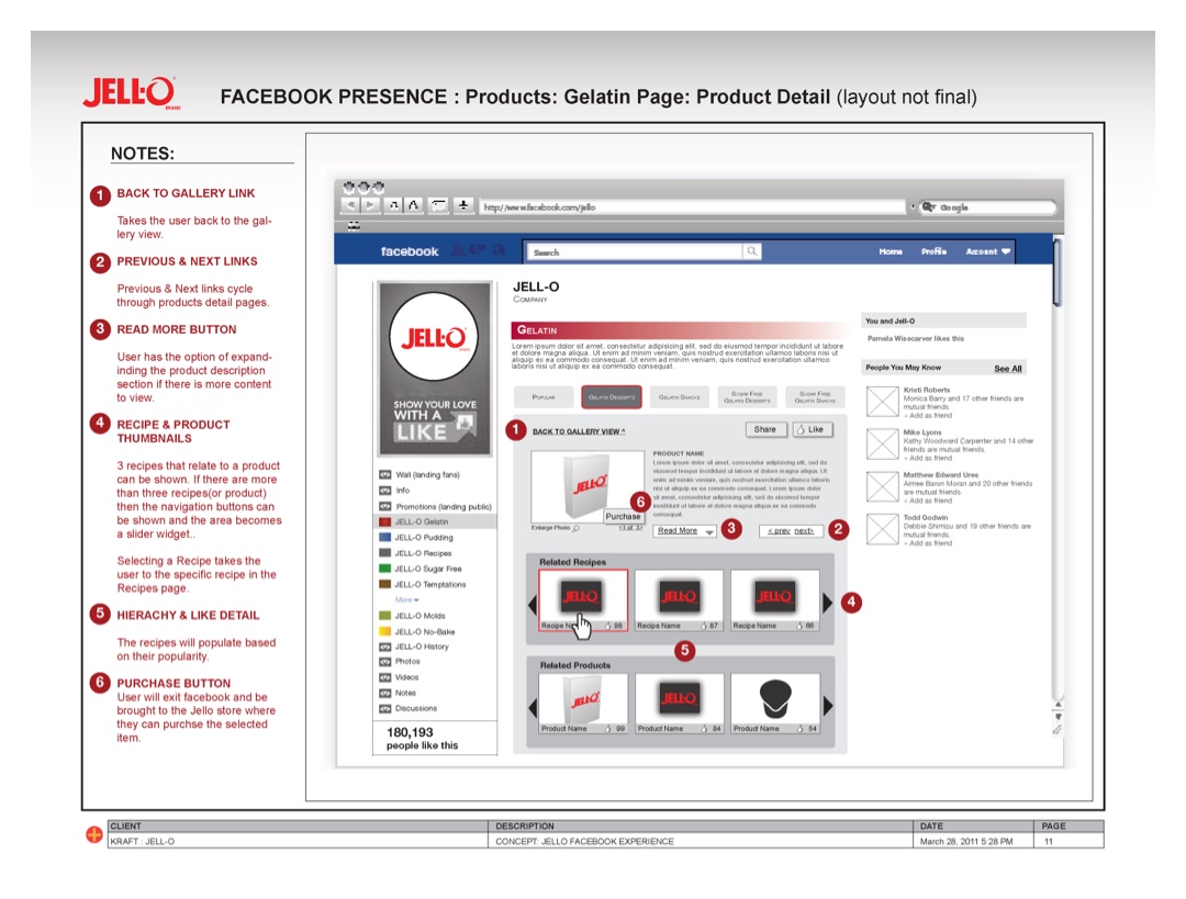
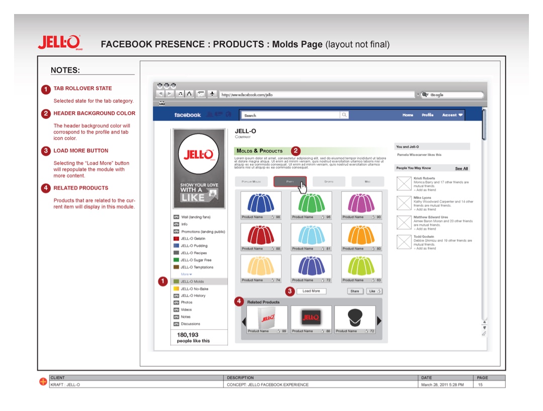
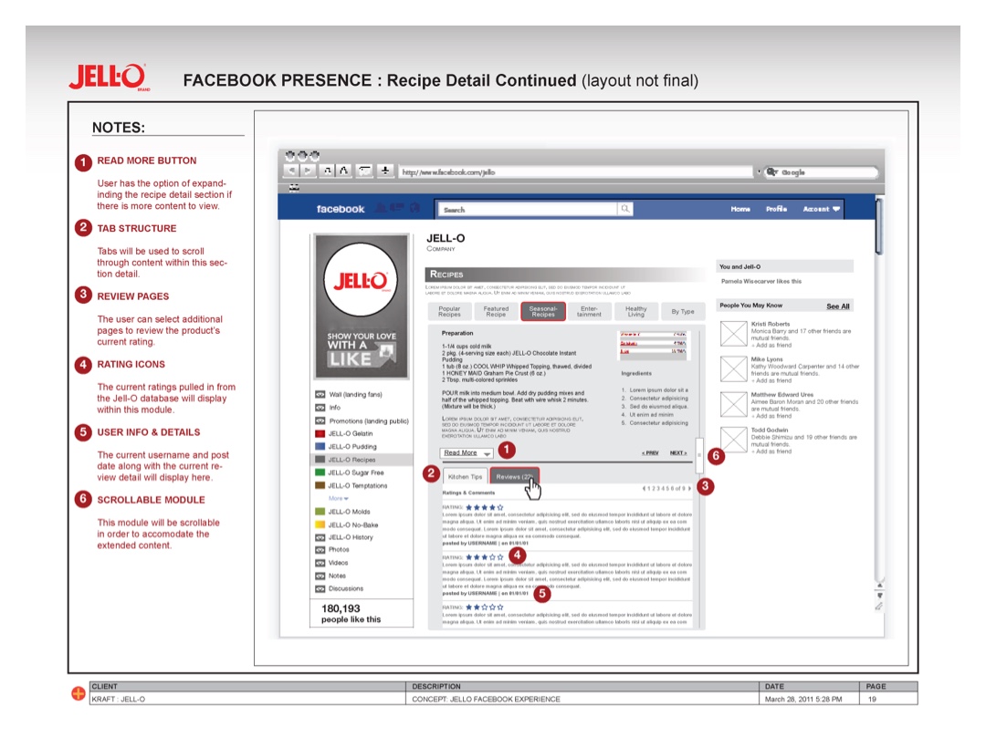
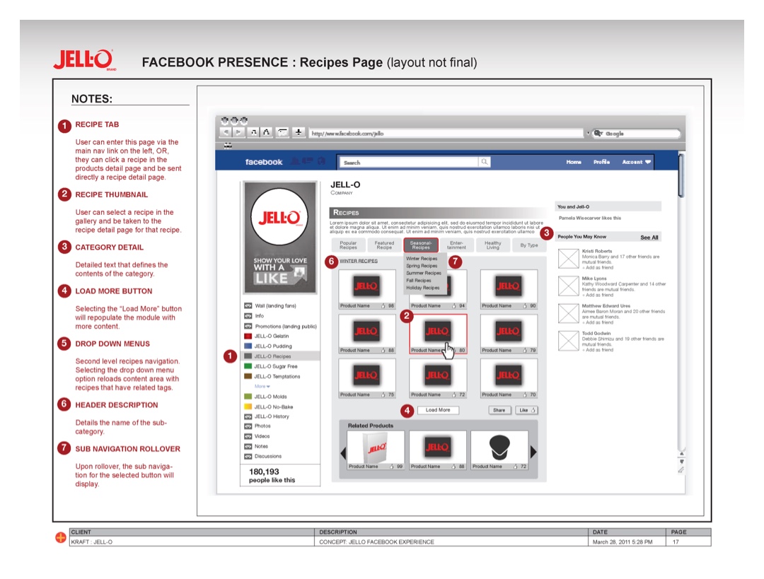
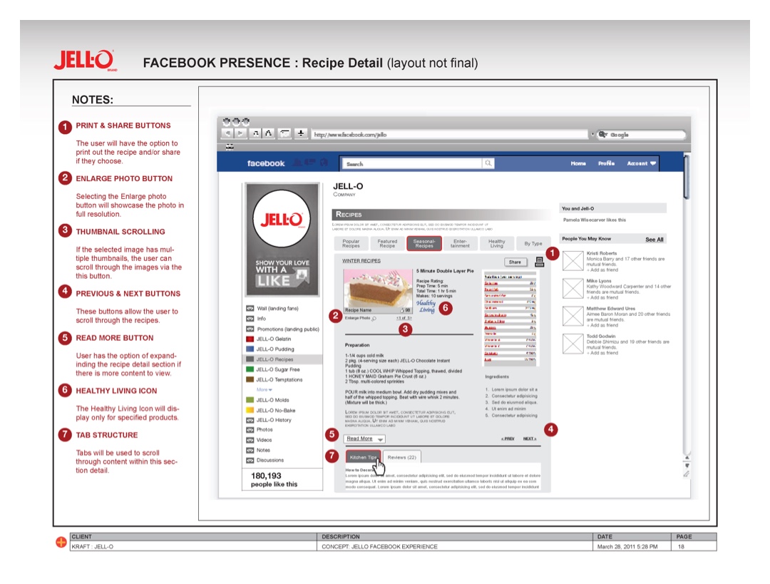
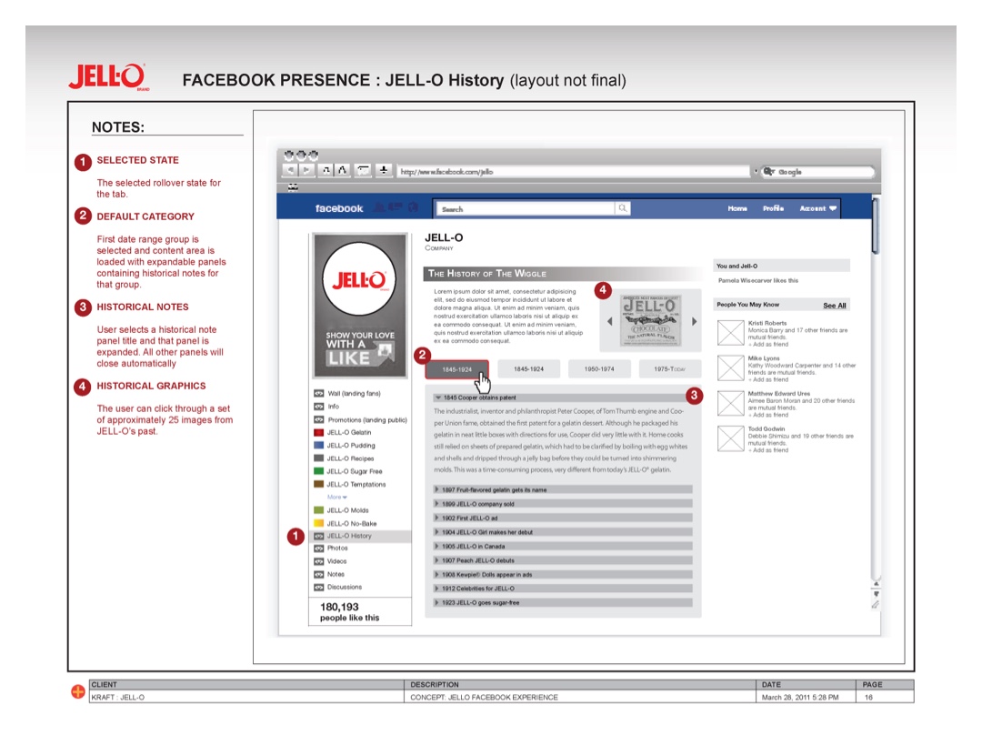
Final Screen Layouts
